Css3 display:flex 布局示例
一、flex-direction: (元素排列方向)
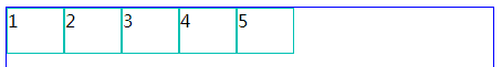
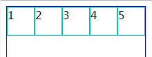
1.1 flex-direction:row (横向从左到右排列==左对齐)
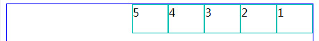
1.2 flex-direction:row-reverse (与row 相反)
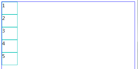
1.3 flex-direction:column (从上往下排列==顶对齐)
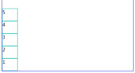
1.4 flex-direction:column-reverse (与column 相反)
二、flex-wrap: (内容一行容不下的时候才有效)
2.1 flex-wrap:nowrap (超出不换行,很奇怪里面的宽度会变成100%)
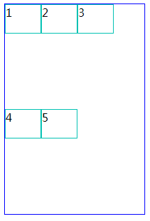
2.2 flex-wrap:wrap (超出按父级的高度平分)
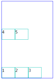
2.3 flex-wrap:wrap-reverse(与wrap 相反)
三、justify-content: (水平对齐方式)
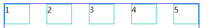
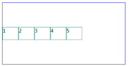
3.1 flex-start (水平左对齐)

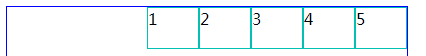
3.2 justify-content:flex-end; (水平右对齐)
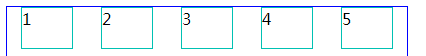
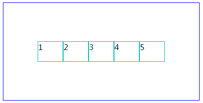
3.3 justify-content:center; (水平居中对齐)

3.4 justify-content:space-between; (两端对齐)
3.5 justify-content:space-around; (两端间距对其)
四、align-items: (垂直对齐方式)
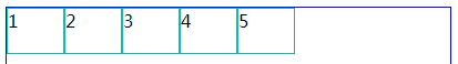
4.1 align-items:stretch; (默认)
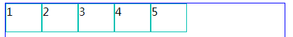
4.2 align-items:flex-start; (上对齐,和默认差不多)
4.3 align-items:flex-end; (下对齐)

4.4 align-items:center;(居中对齐)
4.5 align-items:baseline; (基线对齐)
还没搞明白基线对齐是什么意思。
以上是对flex的简单介绍。下面有个小例子,
<!DOCTYPE html>
<html>
    <head>
        <meta charset="UTF-8">
        <title></title>
        <style type="text/css">
            #box{
                display: flex;
                display: -webkit-flex;
                border: 1px solid #0000FF;
                height: 200px;
                width: 400px;
                align-items:center;
                justify-content:center;
            }
            .item{
                width: 50px;
                height: 40px;
                border: 1px solid #00C1B3;
            }
        </style>
    </head>
    <body>
        <div id="box">
            <div class="item">1</div>
            <div class="item">2</div>
            <div class="item">3</div>
            <div class="item">4</div>
            <div class="item">5</div>
        </div>
    </body>
</html>